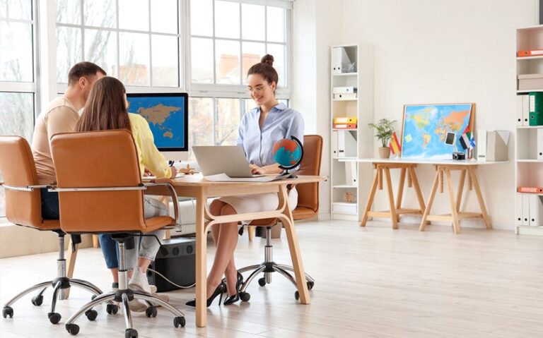
Travel Brochure Design Ideas That Inspire Wanderlust, Engage Readers, and Tell a Story
Are you searching for travel brochure design ideas that go beyond generic templates and stock images? You deserve designs that ignite curiosity, reflect the spirit of the destination, and create an emotional connection with readers. Whether you’re designing for luxury escapes, rugged adventures, or cultural journeys, these 35 creative travel brochure ideas will help you craft brochures that stand out, inform, and inspire. From layout styles to content flow and visual storytelling techniques, these ideas will make your brochures not just informative—but irresistible.
1. Minimalist Design with Bold Typography
Embrace white space and let bold, elegant fonts do the heavy lifting. This design approach focuses attention on essential details while evoking sophistication. Large headlines paired with minimal copy keep the reader’s eye moving. Use high-quality imagery that speaks for itself without cluttering the layout.
2. Storytelling Fold Layout
Design your brochure to unfold like a story, with each panel revealing a new chapter of the travel experience. Begin with an engaging opener, continue with key highlights, and end with a powerful call to action. This narrative flow creates a more immersive experience for the reader. Visual cues like arrows or lines can help guide the journey across the panels.
3. Use of Local Textures and Patterns
Incorporate authentic textures, patterns, or motifs from the destination’s culture into the background or accents of your brochure. These elements create a tactile, immersive feel even on paper. Ensure they don’t overpower your content by using them subtly as overlays or borders. This approach adds local flavor and enhances the emotional connection to the place.
4. Photo Collage Front Cover
Create an eye-catching cover using a photo collage of diverse attractions, people, and landscapes. This gives a vibrant, energetic first impression and hints at the variety the destination offers. Use overlapping frames or organic shapes to add movement. Keep the title bold and centered to ensure clarity amidst the collage.
5. Interactive QR Codes and AR Elements
Incorporate QR codes that link to videos, virtual tours, or maps for an interactive brochure experience. Augmented Reality (AR) features can bring static images to life when scanned with a phone. This bridges the gap between print and digital, offering a layered storytelling approach. Make sure the codes are elegantly integrated into the design without disrupting flow.
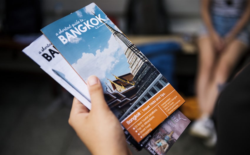
6. Postcard-Inspired Layout
Design your brochure to mimic a series of postcards, with each panel dedicated to a different attraction or activity. Use handwriting-style fonts and postage stamp graphics to complete the theme. This nostalgic style evokes personal connection and wanderlust. It works beautifully for destination marketing with a personal touch.
7. Use Full-Bleed Hero Images
Let stunning full-bleed images dominate your brochure’s cover or interior spreads. These visuals capture attention instantly and set the mood for the travel experience. Pair them with minimal text or quotes to avoid competing with the image. Use high-resolution, emotionally evocative photos that make readers imagine themselves in the scene.
8. Use of Maps as Design Elements
Incorporate illustrated or stylized maps directly into your brochure layout, turning them into both functional and decorative elements. Use icons, paths, and markers to show key locations and suggested itineraries. This gives readers a visual overview at a glance. Maps can serve as engaging backgrounds or interactive infographics.
9. Watercolor Effects for Dreamy Destinations
Apply soft watercolor effects to your images or backgrounds to create a dreamy, artistic feel. This style works well for romantic getaways, tropical escapes, or cultural retreats. Keep the color palette harmonious and gentle to avoid overwhelming the reader. Combine with elegant serif fonts for a polished, upscale look.
10. Fold-Out Panorama Panels
Create a fold-out panel that reveals a wide panoramic image or itinerary. This creates a tactile surprise for the reader and emphasizes the grandeur of the destination. Use the back of the fold-out for key trip details or booking information. It adds drama and gives your brochure a keepsake feel.
11. Eco-Friendly, Earthy Tones and Textures
For eco-tourism or sustainable travel brochures, use earthy color palettes, recycled textures, and hand-drawn elements. Incorporate kraft paper backgrounds, leaf motifs, or natural fibers into your design. This aesthetic reinforces your brand’s commitment to nature and responsible travel. Pair with authentic photography of nature and wildlife for maximum impact.
12. Photo Grid with Asymmetry
Use an asymmetrical grid layout to create a dynamic flow of images and text. Varying image sizes and unexpected placements keep the reader engaged. Balance this with white space to prevent visual overload. This design style is great for showcasing diverse activities or destinations within one brochure.
13. Use of Overlays and Transparency
Incorporate transparent shapes or overlays on top of images to house text without blocking the visual entirely. This creates a modern, layered look while ensuring readability. Use semi-transparent color blocks or gradients to highlight key information. This technique works well for sophisticated, contemporary brochures.
14. Illustrated Icons and Spot Graphics
Add hand-drawn or stylized icons to represent activities, accommodations, or key sights. These playful elements add personality and help break up text-heavy sections. Use them consistently throughout the brochure to guide the reader visually. They also help reinforce your brand’s tone, whether elegant, adventurous, or whimsical.
15. Split-Page Layouts
Use a split-page layout where half the page is dedicated to a stunning image and the other half to clean, minimalist text. This creates balance and makes your brochure feel organized and easy to navigate. This approach works especially well for promoting tour packages or resort amenities. Stick to a limited color palette for sophistication.
16. Seasonal-Themed Brochures
Design multiple versions of your brochure tailored to different seasons—spring blossoms, summer beaches, autumn foliage, or winter wonderlands. Use season-specific imagery, color palettes, and offers to make your brochure feel timely and relevant. This approach keeps your marketing fresh year-round. It also appeals to readers’ emotions tied to the changing seasons.
17. Local Language Flavor
Incorporate snippets of local language phrases, greetings, or proverbs into your design. This adds authenticity and invites readers to connect culturally. Use local typography styles or scripts for headers to enhance the theme. Always pair with translations to keep the brochure accessible.
18. Vertical Booklet Format
Break away from standard tri-folds and experiment with a tall, vertical booklet layout. This format feels modern and allows for striking vertical photography. It’s especially effective for showcasing cityscapes, mountain ranges, or skyscraper views. The unique shape alone will make your brochure stand out on racks or tables.
19. Black and White with a Pop of Color
Use dramatic black-and-white photography throughout the brochure and add pops of vibrant color in text, icons, or overlays. This creates a stylish, timeless look while drawing attention to key elements. It’s particularly effective for luxury or historic travel experiences. Keep the color consistent to maintain harmony.
20. Interactive Checklist Brochure
Turn your brochure into a traveler’s checklist, with tick boxes for must-see spots, activities, or packing lists. This makes the brochure interactive and useful beyond initial browsing. Design the checklist in a playful or elegant style that aligns with your brand. Readers will be more likely to keep and reference the brochure during their trip.
21. Use of Handwritten Fonts for a Personal Touch
Incorporate handwritten or script-style fonts for headings, pull quotes, or section titles to give the brochure a personal, diary-like feel. This style works especially well for experiential travel or boutique tours where intimacy is key. Combine it with candid photos or traveler testimonials to build emotional connection. Ensure readability by balancing it with clean body fonts.
22. Illustrated Travel Journals
Design your brochure to resemble a traveler’s journal, complete with doodles, handwritten notes, and taped polaroid-style images. This approach creates a whimsical, immersive feel that makes readers feel part of the journey. Use notebook textures or lined paper backgrounds to complete the look. It’s perfect for youth travel, adventure tours, or creative brand identities.
23. Magazine-Style Editorial Layout
Adopt a magazine-style design with feature articles, bold headlines, and full-spread images. This editorial approach feels premium and allows for deeper storytelling. Include sidebars with insider tips, interviews with locals, or top-10 lists to add depth. This layout works beautifully for luxury or experiential travel brochures seeking a polished, upscale aesthetic.
24. Vintage Travel Poster Aesthetic
Channel mid-century travel poster vibes using retro fonts, bold color blocks, and stylized illustrations. This nostalgic design evokes the golden age of travel and works well for destinations with historic charm. Use grainy textures or faded colors to complete the vintage feel. It’s a playful, attention-grabbing approach that stands out in a sea of modern brochures.
25. Fold-Out Map Brochure
Create a fold-out brochure that doubles as a map, with key attractions, itineraries, and hidden gems marked clearly. Readers can use it as both inspiration and a practical guide on their trip. Design the reverse side with imagery, trip details, or package information. This functional format ensures the brochure stays with them beyond the first glance.
26. Use Monochrome Color Themes
Stick to a single color theme—like shades of blue or earthy greens—for a cohesive, visually striking brochure. This minimalist approach makes your brochure feel modern and organized. It’s especially effective for destination brands that want to emphasize calm, serenity, or sophistication. Use color variations for headings, icons, and overlays to add visual interest without clutter.
27. Puzzle or Game-Inspired Brochure
Engage readers by incorporating puzzles, quizzes, or games into your brochure design. For example, a crossword of local terms or a travel bingo checklist can make the brochure interactive and memorable. This playful approach works well for family travel, youth tours, or activity-based destinations. It adds an element of surprise and delight to traditional brochures.
28. Die-Cut Brochures with Unique Shapes
Break the mold by using die-cut designs shaped like the country, an iconic landmark, or a suitcase. This tactile element grabs attention and makes your brochure instantly recognizable. Ensure the shape complements your content and doesn’t hinder readability. Unusual formats work well for high-end, creative, or boutique travel brands.
29. Traveler Testimonial Highlights
Dedicate panels or sidebars to genuine traveler testimonials and stories. Include candid photos, quotes, or short narratives to build trust and authenticity. Readers connect more deeply when they hear real voices sharing their experiences. Combine these testimonials with calls to action to encourage bookings.
30. Infographic-Focused Brochure
Use infographics to present data, itineraries, or comparisons in an engaging, easy-to-digest format. Visualizing information helps readers quickly grasp the value of your tours or destinations. Use icons, charts, and timelines for visual impact. Keep the design clean to avoid overwhelming the reader with too much information at once.
31. Vertical Accordion Fold Design
Create a vertical accordion fold brochure that reveals different regions, activities, or seasons as the panels unfold downward. This creates a fun, interactive experience and allows you to showcase multiple layers of information. It’s perfect for multi-stop tours or destinations with diverse offerings. Use color gradients or transition elements between panels to maintain flow.
32. Local Photographer Feature Panels
Collaborate with local photographers and dedicate space to showcasing their work in your brochure. Include short bios and quotes about their favorite spots or hidden gems. This supports local artists while providing authentic, captivating imagery. It also builds credibility by offering insider perspectives of the destination.
33. Use of Watermark Overlays for Subtle Branding
Add subtle brand elements as watermarks or background graphics to maintain brand recognition without overwhelming your design. This works well for creating consistency across different brochure editions. Use your logo, tagline, or signature icon in a faint opacity. This ensures the brand stays present even in minimalist designs.
34. Pop-Up Brochure Elements
Incorporate simple pop-up elements or fold-outs within the brochure to create a 3D effect. This adds a sense of wonder and playfulness, making your brochure feel like a keepsake. Use this technique sparingly for key attractions or signature experiences. It works best for boutique destinations, family travel, or promotional mailers.
35. Personalized Brochure Templates
Allow for personalization by leaving spaces for travelers to write notes, check off bucket-list items, or mark their own routes. This interactive element turns the brochure into a keepsake or planner. Include prompts like “My favorite memory” or “Must-see spot” to encourage engagement. Personalized brochures create a stronger emotional bond with your brand and the journey itself.