Pixel Patisserie: Craft Visuals That Look Good Enough to Taste with AI
In the shimmering world of digital design, visuals don’t just look good anymore — they taste good. Brands have discovered a new design language built on sensory illusion, where pixels melt like butter and gradients swirl like whipped cream. This is the era of flavor design, where textures become temptations and colors are plated like desserts.
What gives a digital croissant a flaky texture or a pastel background a creamy aspect? It’s the chemistry of combining light, tone, and composition until your screen smells like vanilla. That’s where Dreamina comes in — your imaginative pastry chef for the pixel kitchen. With the assistance of an AI photo generator, you can create scenes so full of texture and warmth that they could starve viewers into hunger.
Designing flavor into shape
Flavor design isn’t about demonstrating food — it’s about creating taste through texture. The intention is to get a viewer’s senses to intersect: to look at smoothness, touch crunch, and smell sweetness through hue. A few carefully considered design elements can make a visual appear consumable:
• Soft light: diffused highlights that imitate sunlight on frosting.
• Foodie color schemes: pastel pink, toffee brown, pistachio green, and creamy white.
• Depth and blur: achieving that “bite-ready” level of realism that fools the eye into seeing texture.
• Shape repetition: smooth, rounded, or dolloped shapes that bring to mind sweets.
With these, they form designs that don’t merely invite — they entice. From a packaging mockup to a product commercial, the outcome feels as if you could lick the screen.
Where imagination rises like dough with Dreamina
All visuals have ingredients – only the great ones have flavor. Dreamina enables designers to play with light and surface the same way bakers would with batter: you fold warmth, gloss and creaminess into the process until the final image has a richness you could almost taste! Whether the campaign is for dessert or the branding is for your booth at a café with “digital frosting”, Dreamina will let your visuals come out golden-brown, ready to eat!
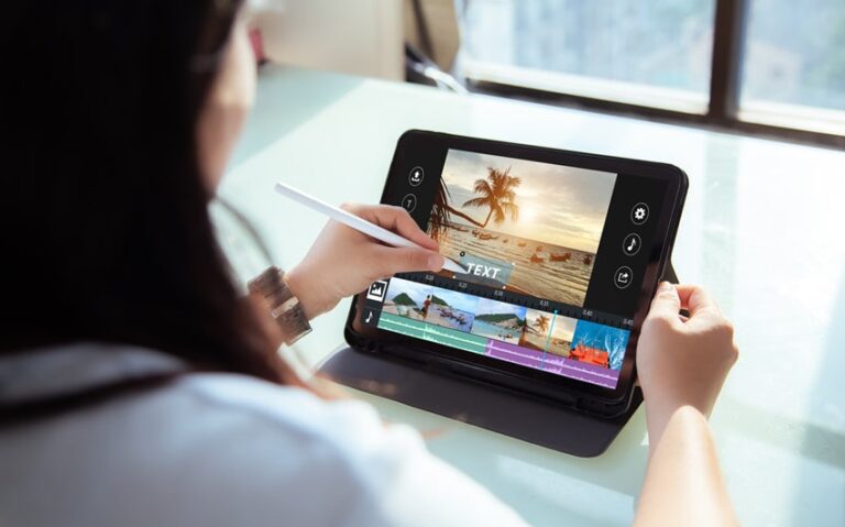
Step 1: Write a text description
Begin by going to Dreamina and designing your visual recipe. Consider your prompt as a description of a dish — sensory, vivid, and detailed.
For example, you could write: A strawberry mousse-inspired product poster, close-up of creamy pastel color, glossy highlights, soft studio lighting, and a swirl of texture looking like whipped cream, looking delicious and elegant.
The more sensory your description is, the richer the visual result. Dreamina brings your words into images that embody flavor through texture and light.
Step 2: Refine parameters and generate
With your prompt now in hand, fine-tune the creative parameters to get that ideal “baked” look. Choose the model best suited for your style — realistic for food shots or stylized for creative ads. Change the aspect ratio to suit your intention (square for Instagram, vertical for posters), enter the size, and choose between 1K and 2K resolution for sharpness and depth. Then, hit Dreamina’s icon to create your image — and see your digital dessert materialize.
Step 3: Personalize and download
Now, fine-tune your work as a pastry artist on a quest for the ultimate glaze. Employ Dreamina’s AI editing features to fine-tune your image. Inpaint to correct ragged edges or introduce soft highlights, enlarge the composition to provide more space to your subject, eliminate extraneous clutter for crisp presentation, and retouch patches for that irresistible luster. When your work is simply “flavored to perfection,” tap on the Download icon to save and serve your visual delight.
Tasting color: the psychology of edible palettes
Color takes center stage in flavor crafting. Pale colors connote sweetness and nostalgia; warm neutrals connote comfort and tranquility. Designers employ color like spice — sparingly, mindfully, and always in equilibrium.
• Peach and coral are succulent and appealing.
• Mint and pistachio are refreshing and mildly sweet.
• Caramel and latte shades connote warmth and richness.
• Cream whites and gentle pinks convey smoothness and luxury.
The correct color palette can make even abstract imagery feel tactile. A brand advertisement in muted gradients can induce hunger, coziness, or happiness — all without depicting a single food item.
Texture as the new flavor
Texture is where vision and touch merge into feeling. A genuinely “tasty” design is palpable. With texture, you can make clothing feel rich, metal feel caramelized, or a light glaze.
In the virtual patisserie of contemporary advertising, designers commonly employ:
• Matte finishes for understated sophistication.
• Gloss to mimic moisture or icing.
• Soft focus to reproduce the ethereal blur of a pastry case.
• Micro contrast to render surfaces sharp and tangible.
Dreamina is particularly good at evoking these sense memories, enabling designers to tap out texture that provokes feeling — rather than mere notice.
Brand identity with a sweet tooth
Flavor design is not only applied to food brands. Beauty, fashion, and lifestyle startups all borrow the look of “tastiness” to express warmth and indulgence. A cosmetics brand can employ a cream-colored background that resembles frosting. A candle company can create its imagery to look like bowls of gelato.
When you’re crafting those brand looks, the AI logo generator turns into this really handy thing. It lets companies design logos that match their yummy vibe pretty much perfectly. Like, picture one with gentle bends and soft, rounded parts that bring to mind little macarons. Or go for a shiny metal shine that suggests all that rich, caramelized fancy stuff. Letters count too in this setup. Bold smooth typefaces come across as way more edible. Sharp angular ones just don’t hit the same.
When the digital world feels edible
The secret of flavor design is to make individuals feel hungry without knowing why. The perfectly calibrated design can make your mind perceive warmth as sweetness and lightness as freshness. Even subtle designs can have this capability if their visual rhythm corresponds with the sensory experience of taste.
You can amplify this illusion by:
• Incorporating gradient illumination that replicates natural sunlight on frosting.
• Employing a shallow depth of field to produce a creamy blur surrounding your subject.
• Employing subtle motion cues such as shadow shift or layered glow to mimic melting.
These minor adjustments give your visuals a nearly lifelike quality — the kind of thing you might spoon off the screen.
Buffing the plate with AI sheen
Even the loveliest images can use some polishing. With Dreamina’s AI image editor, you can refine the sensory quality of your piece: blur textures, smooth transitions, or color up until the composition looks just right “baked.” The precision of the editor enables you to fine-tune highlights and contrast as a chef fine-tunes sugar and salt — adjusting perfection pixel by pixel.
Serving the final creation
When executed well, flavor design is unadulterated sensory storytelling — a universe where pixels dissolve, hues burst, and every picture tastes nice enough to devour. Dreamina turns that fantasy into craft, allowing creators to whip up digital patisserie that provokes emotion, memory, and hunger at the same time.
So the next time you compose, consider yourself a dessert artist: measure out your colors, whisk your light, and plate your design with love. Because with Dreamina, even pixels are delicious — and every picture can make your audience hungry for more.